A few months ago, I discovered Kibana, back then, Kibana
was still on 3.0 and lacked aggregation histogram, which I desperately needed,
so I forked Kibana, and made
lots of changes to it. Now Kibana
4 beta is out, and it looks like it rendered many of my changes unnecessary.
Nevertheless, my work on Kibana
has been enormously helpful in my analysis of logs. The fork is https://github.com/penguincp/kibana,
branch 3.0agg.
Human brains are marvelous, but they are not good at dealing
with massive unorganized data. I use Logstash
to organize loggings, send them to ElasticSearch,
use Kibana to query and show
loggings and sometimes export them to CSV for further analysis.
I call a logging an event, which can be divided into
subevent. For example, if the logging is “fail to hear from k1 for over 3
minutes”, it is a “cluster failed” event with the subevent “no heard from k1”.
Aggregation histogram
The change is mainly done on histogram app/panels/histogram/module.js, which
was used to display facet histogram. In a facet histogram, you won’t be able to
see events stacked together in the same column.
With aggregation histogram, events are stacked in the same column.
Below is a chart showing events “OOM” and “restart”:

By default, aggregation histogram chart is aggregated on the
field “event”, you can change its default setting by clicking on the
“configure” button at the right corner of the chart. An event can be divided
into subevents, so you can further do aggregation histogram on subevents:
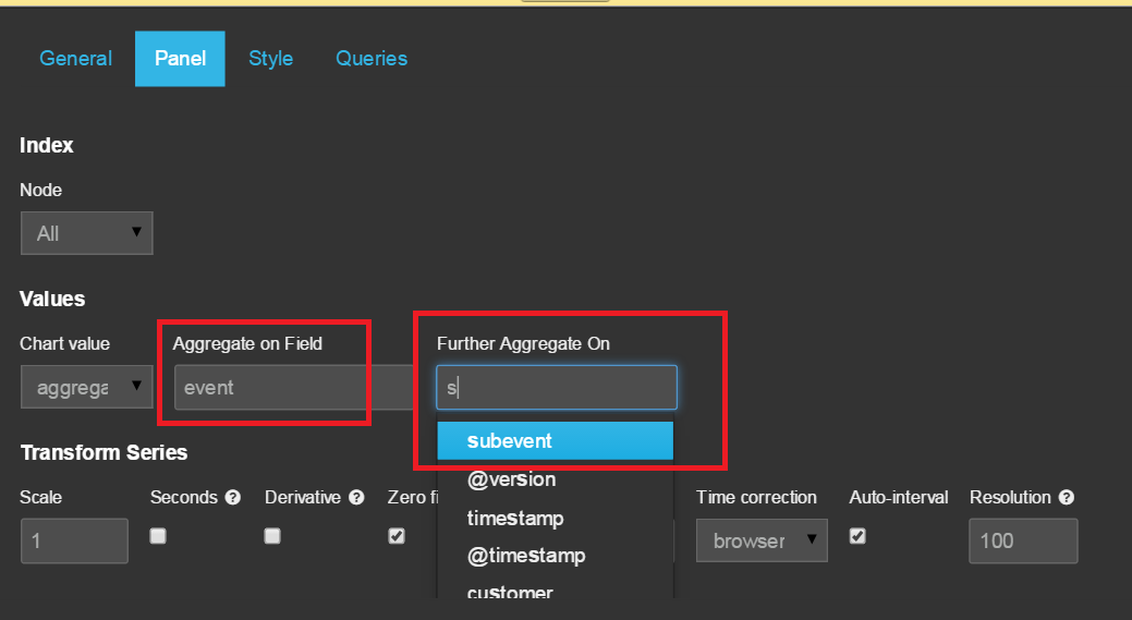
The following chart is a subevent aggregation histogram on
event “cluster failed”:

If you’d like, you can divide subevents further, but I do
not think it is meaningful in a chart. If you want to do more detailed
analysis, Excel is an old and reliable friend. That is why I also implemented
“export to CSV” function.
Export chart data and raw data to CSV

The result data is the data that makes up the chart, so you
will get a tablet such as:
time
|
count
|
event
|
2014-09-15T20:00:00
|
2
|
restart
|
2014-09-22T08:00:00
|
4
|
restart
|
2014-09-23T20:00:00
|
4
|
restart
|
2014-09-25T20:00:00
|
10
|
OOM
|
2014-09-29T08:00:00
|
32
|
OOM
|
2014-09-29T20:00:00
|
100
|
OOM
|
This kind of export is pretty useless to me for analyzing
logs, so I usually choose to download raw data. With this option, you can
choose which field to export:

The fields are defined in app/dashboards/logstash.json:
"download":{
"mode":"Result",
"fields":[
{"name":"timestamp", "selected":true},
{"name":"event", "selected":true},
{"name":"subevent", "selected":true},
{"name":"message", "selected":true},
{"name":"msg", "selected":true},
{"name":"exClass", "selected":true},
{"name":"ex", "selected":true},
{"name":"exMethod", "selected":true},
{"name":"exLine", "selected":true},
{"name":"logClass", "selected":true},
{"name":"logClassLine", "selected":true},
{"name":"level", "selected":true},
{"name":"node", "selected":true},
{"name":"path", "selected":false},
{"name":"customer", "selected":false},
{"name":"@timestamp", "selected":false}
]
}
TODO
Right now, the raw data is first retrieved from ElasticSearch and then saved to a CSV
file. When there is a lot of data, export will fail. Retrieving and saving data
should be done in a streaming fashion.
Hierarchical indices
I need to analyze logs from different customers, each
customer deploys the application in a cluster. So the logs have two levels:
customer and cluster node. Kibana
used to only support indices with format logstash-YYYY.MM.DD,
I changed it to support indices with format logstash-customer-node-YYYY.MM.DD.
Indices can be selected through menu custom
(not a very good place for this feature, but I do not want to change Kibana too much):

Charts of nodes have axis that have the same time
range, so you can easily compare what happens at the same time for each node.
TODO
- When you select node, you do not have to move your mouse into the checkbox, you can click on any place that is on the same row as the checkbox, and the checkbox will be checked or unchecked, which is confusing, as an innocent click on the blank will produce charts that are not desired. (this is finished.)
- Timestamps are based on UTC timezone, which is very inconvenient if log files were written in a different timezone, which is typically true for log files that I have to analyze. Loggings should be written to ElasticSearch and shown up in Kibana using the timezone they were written with. (this is finished, please check out What time is it? -- A cheap solution to make Kibana show histogram in logged timezone)
You can select multiple nodes, and choose to show them in
how many rows. You can also change your node selection in panel configure:

No comments:
Post a Comment